
In its 35th anniversary year, London window and door fabricator, Everglade, has launched its new branding.
The ‘driving force’ behind the new brand is marketing director, Reena Gjoci, who said: “We’ve evolved over the last 35 years into a highly respected, forward thinking manufacturer. We’re a trend-setter not a follower. We have kept ahead by continually investing in bringing new products to market to give customers the latest technology in windows and doors. The new logo and colours reflect what Everglade does today; it’s fresh, precise and modern.
“We’re a family and our customers are treated like guests. We make sure they have the best support, whether it’s a friendly voice on the end of the phone with the information they need, or access to the latest changes in legislation, we cover all of it, and everything in between. Our annual customer conferences are legendary.”
“Everglade has a successful 35 year history so we didn’t start with a blank piece of paper. We had to think about the ethos behind the business and our heritage. We’re firmly rooted in the capital and our brand values reflect this by the tagline ‘Made in London’. But it’s not about being red-white-and-blue, it’s about the capital as a modern, vibrant, culturally inclusive city.
“Encapsulating everything we wanted to say into our logo was hard. But we think that the new classic colours of fig and different hues of grey combined with a modern font works really well. We love the new type and the less formal use of all lower case letters in the name.
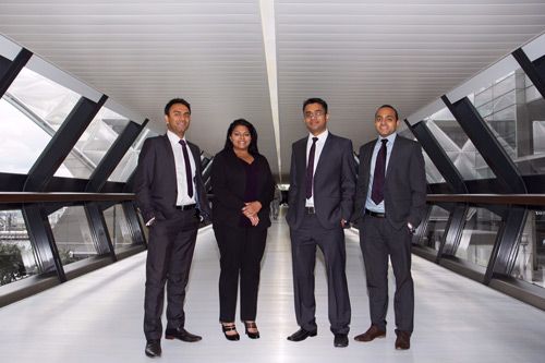
“Expect to see more of our branding as we reveal a fantastic new website, brochures and adverts over the next few months. And expect to see a lot more of Yogesh, Jay, Jayesh and me,” Reena added.


