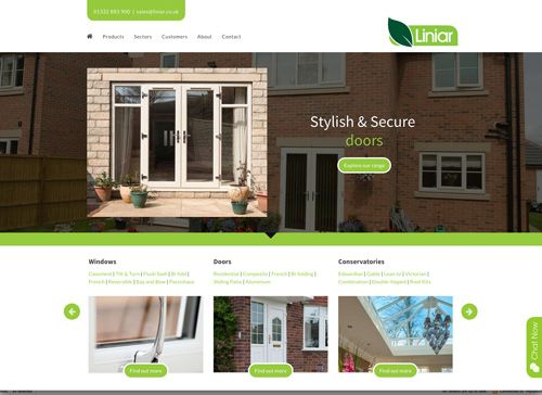
 Liniar has announced that it has redesigned its website. The systems company says that web traffic has quadrupled since the original site was launched less than three years ago, so it has been modified to meet the latest standards, trends and demands.
With new page designs, a simpler navigation process, SEO and content enhancements, the Liniar says the modifications are designed to ensure the website operates to the ‘stringent standards’ expected from the ‘mobile first’ generation – across all devices.
This is said to have included a process of mobile testing to carry out user interface and user experience developments, as well as adjustments to the desktop version of the site to ensure simple and efficient usability is kept consistent across platforms.
“The public perception of our brand is critical to us, and our website is probably the most visible example of how we communicate with customers, installers and consumers,” explained Sue Davenport, Liniar’s marketing director.
“Even though we were happy with our website and its performance, we always strive for perfection – just as we do with our product range. For example, we know that more than 50% of our website visitors are now using mobile devices, so it’s even more critical for them to be able to move around the site easily to find the information they need.
“We also wanted to give the site a fresh, new look at the same time – which once again we designed in-house to ensure we remained consistent with our overall branding. The improved navigation means visitors will get to what they need more quickly, whilst keeping our favourite features such as videos, case studies, blog posts and our ‘meet the team’ page.


